

Interactive time series graph of confirmed COVID-19 cases per country
March 9, 2020
I have been looking for more information about the trends of the number of confirmed COVID-19 cases per country. I could find the numbers for each day, but I wanted a visual representation of the information in order to readily compare the trends in various regions.
John Hopkins University (JHU) has set up a great dashboard tracking the COVID-19 cases worldwide. It contains a time series graph of the overall cases, but doesn't provide such graphs for each country. Thankfully, JHU have made all their data publicly available (for educational/academic purposes) in their JHU CSSE COVID-19 repository.
Since I couldn't find a visualization that matched my needs I decided to create my own interactive graph:
Interactive time series graph of confirmed COVID-19 cases per country
The graph is implemented as a web page that uses client-side processing (i.e., javascript) to plot the time series for one or more countries. The JHU data is fetched and processed by the client on each page load, so the graph will display the latest data without requiring any server-side updates.
For example, this is a plot from that page for France, Italy and Spain as of 2020-03-08:
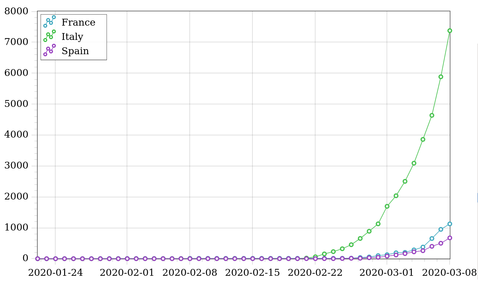
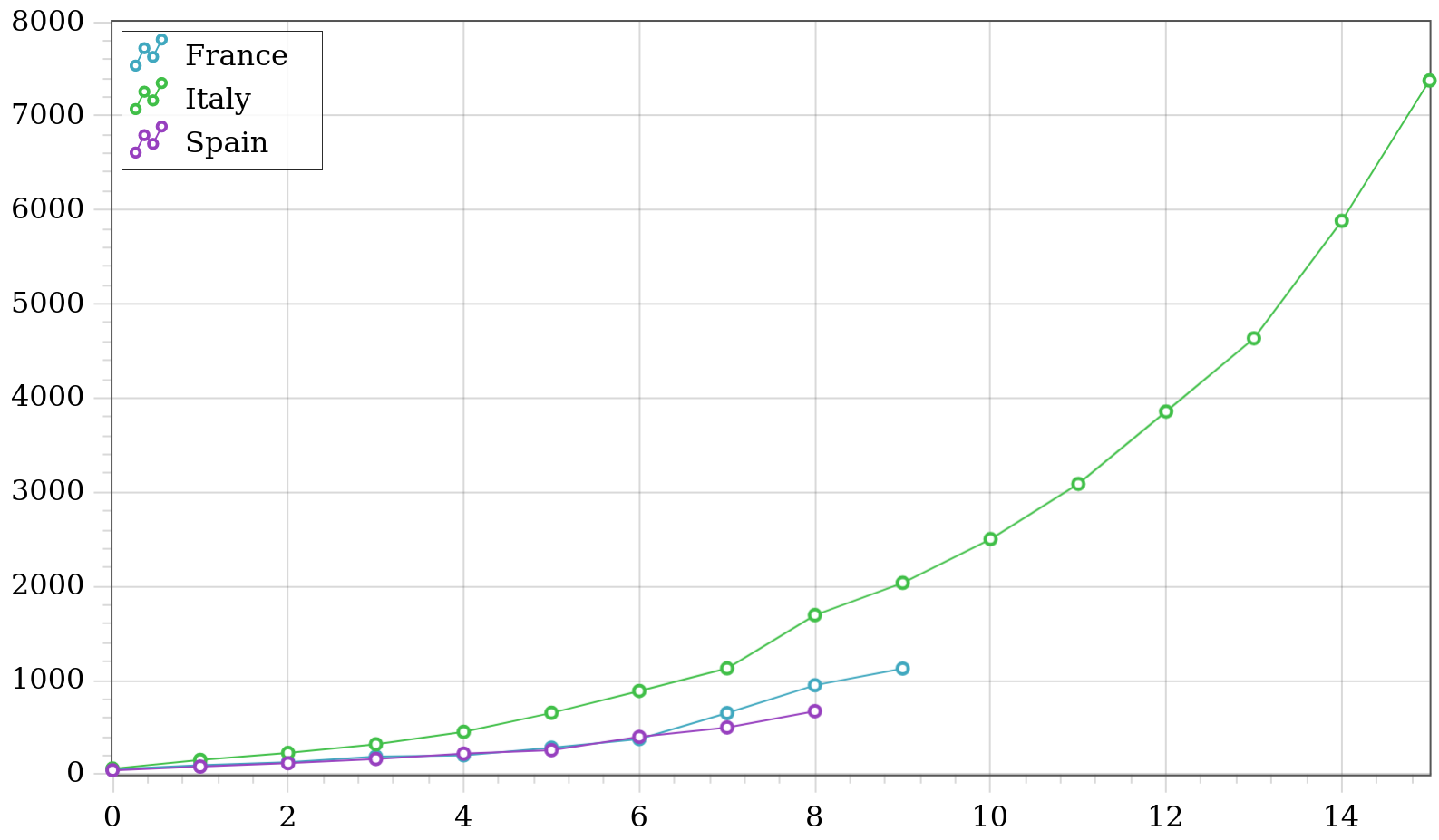
Given the time offset between the trend lines, it's not always clear how the trends compare. To be able to compare trends more easily, I added an option to synchronize the displayed time series so that they start at (approximately) the same confirmed case count. Here is the same series as above but synchronized at 200 cases:

This plot indicates that France and Italy are following roughly the same trend, whereas Spain is faring a bit better.
Before you draw any conclusions about trends that show up after synchronization, keep in mind two important caveats.
First, since our sampling granularity is one day, and jumps in confirmed cases between successive days can be large, starting points for each series after synchronization may in fact be different enough to skew results. For example, we may want to synchronize at around 200, but if one series jumps from 50 to 300, the starting point for that series is not going to be near 200.
Second, using different synchronization points may provide different views of the trends. The same France-Italy-Spain plot synchronized at 40 cases gives:
In this plot we can see that France and Spain initially followed a similar trend, but then France started diverging upwards. This is somewhat apparent in the original, non-synchronized plot, but only because the France and Spain trend lines have a small time offset.
I hope people find this interactive graph informative!